- Home
- Features
- Business
- Active
- Sports
- Shop
Top Insights
Bitcoin Personas: How Coinbits Approaches Crafting User Experience

Introduction
At Coinbits, we’re dedicated to improving the UX of bitcoin so that more people can benefit from it. In our ongoing commitment to transparency and community engagement, we recently made our product roadmap public. Now, we’re excited to share another work product which was made as a part of a Summer of Bitcoin project: Bitcoin Personas.
Persona pitfalls
Coinbits is a family-run bitcoin-only exchange. We are a small startup with a big vision – to build the first #HybridBanking platform that seamlessly combines bitcoin and fiat financial services.
Our team is mostly made up of engineers, but several of us also have a background in product and design. We recently decided to revamp our user personas in order to strengthen our foundation for continued product-market fit.
Personas are fictional descriptions of target users and are used to focus development teams on the human needs of the people for whom they build products. Although they have been a mainstay of UX and innovation teams for decades, in recent years, personas have developed a reputation of being a high-investment project with questionable ROI. This is largely because they tend to be underutilized by the audience for whom they are created – internal engineers, designers, and executives.
Too often, beautifully-designed personas are created by a UX team, presented in a meeting, and promptly forgotten. And even if they aren’t, do they really provide product insights, or are they too fictional, fluffy, and final?
When personas fail, it is likely that one or more of these reasons is the culprit:
- They try to be too broad and inclusive instead of specific and exclusive.
- They don’t tell a character-driven story; they do not feel like real people.
- They go big on superfluous details.
- There are too many of them so they become hard to keep in mind during the product development process.
A better approach
We believe that the best way to approach personas is to think of them as summaries of user research in which the whole development team participated. In other words, engineers, executives, and designers really should have been present during a substantial portion of the user interviews. If a UX team goes off to do research and comes back with a deliverable, the rest of the team will have missed out on the opportunity to build direct, empathetic bonds with the real people who use the company’s products.
Instead, consider the work product to be the interview itself, and conceive of the personas as more akin to documentation of that work product.
Ideally, to run a persona project, a UX owner plays the role of servant leader of a qualitative research project. He or she guides conversations among engineers and users – and then immortalizes the work in a deliverable that is rich in detail and easily surfaced later. In this way, personas serve the purpose of keeping research insights alive for as long as possible.
Methodology
Our product is currently only available to U.S.-based customers, so our research findings should be interpreted as being specific to the United States. We conducted user interviews to gather qualitative data during video chat sessions. Video allowed us to see participants’ faces, body language, clothes, and physical environment.
We facilitated the conversation by asking open-ended questions that would prompt participants to tell stories about their personal lives. Although we steered the conversation back to bitcoin when it deviated too far, we also allowed for free-flowing conversation about sound money, economics, work, spirituality, values, and more.
We interviewed each of 22 users for one hour. On our side, there were 2 to 4 people in attendance and they were free to participate in the conversation.
Here’s a sample of the question prompts we used to move the conversation forward:
- How did you hear about us? When did you join us?
- Why do you buy bitcoin? How do you use it? What have you used it for?
- What are your financial goals looking 5, 10, 20 years ahead?
- What do you think will happen with bitcoin? How will it evolve and affect the world?
- How do you get bitcoin? What apps do you use to buy and manage your bitcoin?
- Are there other bitcoiners in your social circle? What kinds of people? What are the key topics you use to introduce bitcoin? What resources do you use? Why?
- If you had a magic tool that made bitcoin better / more useful / easier, what would it do?
- What’s one thing we can do for you?
The Personas
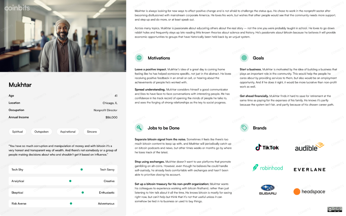
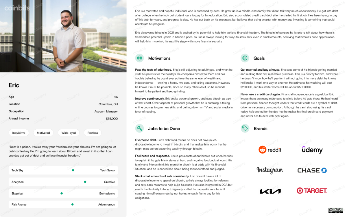
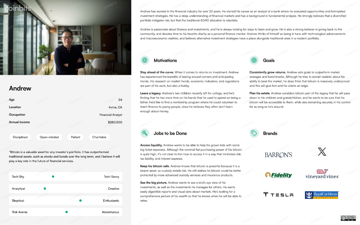
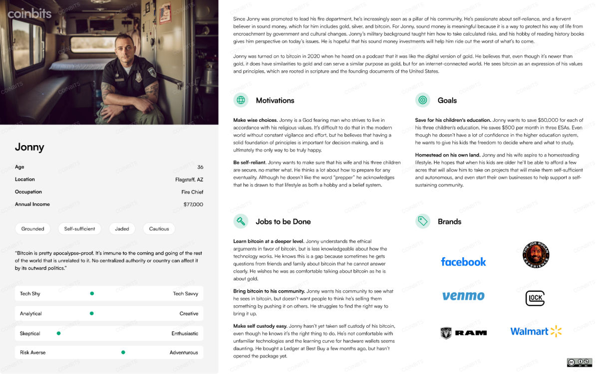
Four personas were created to represent cross sections of our users.
Each persona includes these elements:
- An AI-generated medium-shot.
- Demographics and personality descriptors
- Narrative: Introduction, Motivations, Goals, and Jobs to be Done
- Favorite brands: Short-form content, long-form content, automotive, financial, clothing, and lifestyle.
Here are some guidelines we followed:
- Combine details from multiple user interviews rather than drawing generalizations from those interviews.
- Keep content authentic and based on real encounters with users. We did not impose artificial diversity requirements, and we did not make an effort to find specific types of users we wish we had, or thought we should have.
- Tell stories that make the users memorable and likable. We should want to hang out with these (fictional) people – we should think they’re at least moderately cool. If your personas aren’t likable, how hard are you really going to work to build products for them?
- Keep the number of personas low, so that we will be able to remember them easily.
- Stick to an MVP. As UX practitioners, we love design and storytelling, so it’s easy to indulge in over-designed deliverables. Instead, ship a good-enough persona document, and then go build some software.
You can download the finished product on the Bitcoin Design Foundation website.


What’s next
People who care about bitcoin stand at the threshold of making truly user-friendly experiences. The new Apple Pay feature Tap to Cash is a mainstream example of improving UX for digital payments. It’s an indicator that we may be entering a period when the UX of payments takes a leap forward. Bitcoin certainly has a role to play here – as UX practitioners focused on bitcoin, we are well positioned to make an impact. We would be thrilled if sharing this work inspires someone to contribute to the important project of making bitcoin more user friendly.
Looking to get involved? Check out Coinbits App. We proudly invest a tremendous amount of time and effort in product design, and we would love to hear what you think about it. If this field interests you, consider participating in the community over at the Bitcoin Design Foundation.
By offering these research results under a CC BY-NC 4.0 license, we aim to make a small contribution to bitcoin becoming more user-friendly.
This project includes contributions from Tiffany Lee, Rachouan Rejeb, and David Waugh.
This is a guest post by Dave Birnbaum. Opinions expressed are entirely their own and do not necessarily reflect those of BTC Inc or Bitcoin Magazine.
Recent Posts
Categories
Related Articles
Half Way Through The 4 Year Bitcoin Cycle
Bitcoin’s Four-Year Rhythm: Mid-Cycle Insights and What Investors Should Expect
ByglobalreutersNovember 8, 2024Don’t Lose Sight Of The Bitcoin Mission
Fighting for transaction privacy needs to remain at the core of why...
ByglobalreutersNovember 8, 2024Democrats Must Embrace Bitcoin To Survive
If the Democratic Party is to have a future in US politics,...
ByglobalreutersNovember 8, 2024Trump Is Not Bitcoin’s Savior
Trump is not going to be a good thing for Bitcoin, he...
ByglobalreutersNovember 8, 2024


Leave a comment